The logo is the keystone of any brand's visual identity. In making every logo unique and memorable, by a simple gesture or splendid representation of an idea, the outcome always looks simple, yet the exercise is never easy.

Supreme Commission For Tourism, 2001
20 years ago, when the government of Saudi Arabia decided to form the Supreme Commission For Tourism, I was inspired by Saudi's vast land and diverse topography. I wanted the logo to represent that and include the palm tree and symbol of Saudi Arabia as requested by the client. The result was approved by HRH Prince Sultan Bin Salman and used until the department was rebranded as the Saudi Commission for Tourism and Antiquities. It is now simply The Ministry of Tourism.

Fadi Kilani, 2006
As the sun brings light out of darkness every morning, the lawyer persists in revealing the truth from obscurity. Inspired by the Arabic quote "the truth is as clear as the sun," I designed the logo of my brother's law firm using the clear, clean lines of "Thuluth" calligraphic style.

Derma, 2007
I've had the honor of working on the Derma brand since its inception in 2007 when the founder of Pella Pharmaceutical Manufacturer commissioned me to design its logo. The product's differentiator was that it would be widely produced from pharmaceutical to cosmeceutical to take care of the skin and its core. So, I designed the logo to represent the softness of healthy skin, yet the strength of protection, and to be highly legible on the shelf.

Salam Security, 2007
Designed to specifically project the superior strength and serious nature of the security business. Through illustrating the strategic position of the mythical eagle defending his eaglets, the emblem for Salam Security shouts out, "ready for anything."

TIBA foundation, 2008
TIBA, which means goodness and stands for Traditional Islamic Book Art, is the only foundation of its kind in the Middle East. It was founded by HRH Princess Haya Bint Al Hussein to produce three magnificent copies of "Mus'haf" (the written Qur'an). Every page was prepared, calligraphed, and illuminate with gold, and later hand-bound by the masters of their domains. The logo design for such a perfect idea and content could not be anything less than perfection. The result preserves the ideal letterform of "Muhaqaq" calligraphy while expressing the logotype's unique personality.

Al Jalilah Children’s Specialty Hospital, 2008
HRH Shaikh Mohammad Bin Rashid and his wife HRH Haya Bint Al Hussain conducted an international competition to create the identity for the new hospital. I was honored when my logo design was selected. The meaning behind this logo is femininity, maternity, and sacred responsibility. The golden ratio is used to balance the whole composition, making this humble emblem charming for all time.

Overhaul, 2009
12 years after graduation, I was frustrated by how design companies were managed in the Middle East. It seemed to me that the market needed an Overhaul. I quit my job and started my own company. The transliteration of the word "overhaul" is used in Jordanian streets for the same English meaning. The employment of such a popular neglected accent for a brand name influenced the logo's visual elements. The forgotten post stamp symbolizes identity, which is the topic of interest for the company. At the same time, the disregarded "Dot Matrix" font style will introduce my passion for typography. These discarded items have subsequently been emboldened with a vermilion red in recent years.
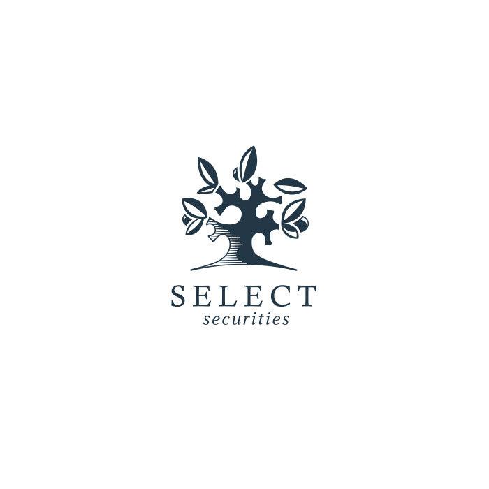
Select Securities, 2009
Many hidden opportunities surround us, and many hunters waiting for them. The founder of Select Securities describes what they do as "revealing those investment opportunities to corporations or individuals who wanted to broaden their portfolios." Life is similar to a tree full of fruits hidden under big leaves just waiting for us to collect them. A contemporary-looking emblem with a warm feeling illustrated the concept.

SmartSat, 2009
Being tasked to create an identity for the first private Arabic satellite was a unique challenge. As the satellite was based on the latest technology, it seemed natural to develop a logo and visual identity, paying homage to the earliest scientific Islamic minds who pioneered Astrolabe. Later, by illustrating the stars' paths, they inspired Muslim artists to design special Islamic geometrical ornaments. This logo intends to simplify these meanings with an artificial moon shape in sky tones graduating from day to night.

Zena Habi, 2010
Extremely feminine and yet highly energetic, my design for the personal identity of Zena Habi, Reebok representative for the Middle East, embodies her unique personality and attitude toward life. This collaborative design work was done with Hani Adnan.

Avitech, 2010
An endless line that seems to represent flight itself. This fresh logo treatment for the trading company Avitech, which provides additives for aviation motors, makes a clear promise to their clients that the engine will take off and run uninterruptedly.

Level Five, 2011
This interior design firm, with its contemporary portfolio, commissioned Overhaul for a rebranding job. At the beginning the process was disorganized, three designers worked on this logo through most of the journey, at the end it turned to me to develop the final version of this logo. I took my direction from their professionalism, accuracy, and industry-leading respect for and attention to detail in everything they do, dot by dot.

Ketab Studio, 2012
It's always hard to design a bilingual logo, especially when the brief says, "it should look simple, contemporary, and unique." You know if you do it, the result would be very special! Ketab Studio is a smart board software aimed at schools in the Middle East. The Arabic word Ketab means book and is better shown in its own language script. However, for a brand that wanted to be recognized internationally, Latin letters couldn't be omitted from the emblem. In this logo, I combined all the Arabic letters of Ketab in its Latin "K," as illustrated here.

Presstige, 2013
When my friend Wissam Makhloaf decided to move to Erbil, to establish new press there, he asked me to help him find a name relating to printing which also had a grand meaning. Ironically one spelling mistake brought it all together. A slip that was reflected on the logo illustrates the metal type technique, allowing more space for the word "press."

Queen Alia International Airport, 2014
The rational of this logo can be read here, but in this review, I wanted to tell the story of how I created it. It was a competition that I didn't know about until it was too late to submit the work. I talked to the authorized department and managed to get 24 hrs to present my design. It was the fastest logo I've ever designed. Yet the longest period I've ever waited for feedback, as the logo had to be approved by his Majesty King Abdullah II. I waited for 18 months until the royal court came back to me with the good news that my work has been honored. That started another journey, to design a comprehensive visual Identity!

Fadi Aabidi, 2015
A businessman, a pilot, scuba diver, falconer, deer hunter, and a photographer; all in one man! This superman asked me to design his personal logo. The logo needed to reflect his energetic, ambitious personality yet his high appreciation for art and design. I created these unique letters for the legendary Fadi Aabidi.

Dr. Oday, 2018
The eye and the letter "Ain" in the Arabic alphabet have the same name and pronunciation. So when the client's name started with the "Ain" letter, knowing that he is an eye doctor, it made sense to base his logo on that. A clear "Ain" letter is embedded gently in the illustration of a pupil to shape the emblem set above "Taa'liq" calligraphy.

Amman Bus, 2019
This logo combines Arabic and English typography within the shape of a bus, making it easy for everyone to read, even the illiterate. Watching my logo moving around in my beloved city Amman, and interacting with my big family is one of the greatest encouragements to keep up the hard work!

Karmeh Design Studio, 2020
Two very talented interior designers, Lubna Badran and Ernest Saqa, came to me with a ready sketch for what they wanted when rebranding their studio! I thought this could be an easy job, yet I was scared to satisfy such skillful colleagues. No doubt the job was far from easy! To overcome the optical balance in this very tricky shape, it took me over 15 revisions to shape up this elegantly balanced form and satisfy my friends.

Self-logo, 2021
I created my personal logo 15 years ago. It was simply my portrait next to my name, no concept or message to deliver, just showcasing my skill. Today, I wanted to redesign my logo. Replacing the illustrated face with my name in Arabic Kufi Murabba'a expresses my maturity and passion for Arabic typography and calligraphy. My focus for the coming years will be to produce better Arabic typefaces. Perhaps I will become "the face of type," as my logo is trying to say!
Logo making is a true test of our design skills!